

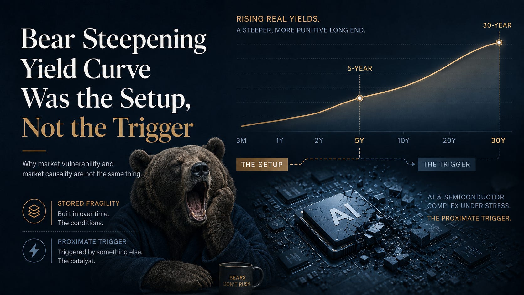

(Markets move fast. Everyone has already moved on to the Aug 19–20 announcements — and that’s where my next research piece is headed.)
But first, one rewind to the Aug 18 selloff.
Around Aug 17, 18, I went back and tested the story I had originally been telling myself: rising real yields and a bear-steepening Treasury curve had made technology increasingly fragile — but were rates actually the trigger when the selloff finally arrived?
The evidence says no.
Rates mattered during the setup. But by Aug 18, Treasuries were rallying while the technology complex was breaking.
The more useful distinction turned out to be:
vulnerable state ≠ catalyst ≠ transmission mechanism.
The curve was the setup. It wasn’t the trigger..
When you have been in the Trading business long enough, Charts trick your eyes, convenient and lazy market commentary spike your stress cortisol level, which is why we rely to Stats to justify/disprove our intuition, biases, and narratives.
I was long delta before and after Citadel buying Situational awareness asset and when semi was going through slow motion trainwreck ( or fast motion trainwreck depending on gross/net exposure, delta, gamma and vol profile. ) Not recklessly long, but long enough that the tape mattered. I also had volatility on through a combination of calls and underlying, so I wasn’t naked to the downside. Still, there is a difference between owning convexity intellectually and actually wanting to use it.
By the middle of July, something in the rates market had started bothering me.
Equities were still behaving. Credit wasn’t screaming. There was no obvious funding accident. The AI complex was expensive, yes, but expensive assets can remain expensive for much longer than short sellers remain solvent.
The problem was the curve.
At first I assumed I knew the story: real yields were rising, duration was getting more expensive, and eventually the equity market would have to notice.
That explanation turned out to be partly right.
The mistake was assuming that the thing which made the market fragile would also be the thing that eventually broke it.
It wasn’t.
And the 5-year Treasury ended up being more useful in working that out than I expected.
The first warning was not the 30-year. It was real rates.
If I have to put one operational date on the beginning of the rates problem, I use July 1, 2026.
There is some discretion here.
The local trough in the 10-year real yield occurred around June 29 at approximately 2.16%. June 30 was already 2.20%.
By July 1 it was:2.25%.
By July 31: 2.47%.
Twenty-two basis points in a month.
That does not sound dramatic until you remember what kind of equity book is most sensitive to a rising real discount rate: long-duration, high-multiple growth.
Which was precisely where a lot of the market’s crowded exposure lived.
A HAC-adjusted linear trend from July 1 through July 31 gives roughly:
+0.93 bp of real-yield increase per trading session
with a t-statistic around: 13.5.
I don’t need the t-stat to tell me that 22 basis points happened.
What it tells me is that this wasn’t one bad auction or one noisy CPI session masquerading as a trend. There was persistence to it.
At that point my working hypothesis was straightforward:
Real yields are repricing higher. If that continues, the equity market’s tolerance for stretched multiples should deteriorate.
Reasonable.
Incomplete, as it turned out.
Then I added the 5-year.
This changed the way I thought about July.
From July 1 through July 31, the Treasury curve moved approximately:
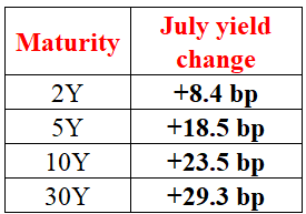
That is a beautiful little table.
Not because it confirms my view.
Because it tells you what the view ought to be.
The selloff was not isolated to the 30-year. The belly participated materially: 5-year yields rose more than twice as much as the 2-year.
But the damage increased almost monotonically as you travelled farther out the curve.
+8.4.
+18.5.
+23.5.
+29.3.
That’s not a random 30-year tantrum.
It’s a broad rates repricing with an increasingly punitive long end.
And then, late in the month, the character of the move changed again.
July 29 was when I stopped thinking about a generic rate shock
Compare July 28 to July 29:
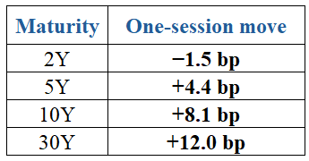
Look at the shape rather than the numbers.
The 2-year rallied.
The 5-year sold off.
The 10-year sold off harder.
The 30-year got hit hardest.
That is not a parallel duration selloff.
The curve was pivoting.
2s30s widened from roughly:
81.1 bp to 94.6 bp in one session.
That is the point at which “rates are rising” stopped being a sufficiently useful description.
The more useful question became:
Why is the long end continuing to cheapen when the front end is no longer participating?
A segmented trend search — descriptive, not some magical proof of a structural break — places several curve changes around July 27–29.
The 5-year’s previous upward acceleration largely stops around then.
Real-yield momentum also begins losing force.
Yet the 10-year and particularly the 30-year continue to reprice.
That’s important.
My interpretation changed from:
general real-rate shock
to something closer to:
real-rate shock first → then increasingly long-end-specific pressure.
That second component can contain all sorts of things:
term compensation, inflation-risk compensation, fiscal duration supply, nominal-growth expectations, demand for duration, foreign demand, balance-sheet capacity.
Prices alone cannot identify each component cleanly.
But they can tell us when the Fed path and real-rate story are no longer sufficient.
And that’s exactly what started happening.
But the equity tape wasn’t agreeing with me
There was another thing bothering me, and this one came from watching the tape rather than the Treasury screen.
I kept looking at SPHB versus SPMO.
My prior from previous long-end shocks was straightforward: when the 30-year yield really starts misbehaving, high-beta equities normally show it. SPHB should begin taking more damage. Risk should start leaking out of the expensive end of the book.
But I wasn’t seeing much of that.
The long end was selling off. The curve was steepening. Real rates had already moved materially higher. Yet the high-beta factor wasn’t visibly deteriorating relative to momentum in the way I expected.
That bothered me more than if everything had simply sold off together.
Because if my story was “long-end rates are tightening financial conditions and beginning to break equity risk”, the cross-section of equities should have been helping confirm it.
It wasn’t.
That was the point where I stopped asking, “How bad is this bear steepener?”
and started asking:
“Am I looking at the actual transmission mechanism — or just a vulnerability that hasn’t found its catalyst yet?”
That became the question behind the rest of the study.
Was this actually a belly distortion?
Before going further I wanted to kill another attractive story.
Maybe the curve wasn’t simply steepening.
Maybe there was some unusual curvature developing — a 5-year or 10-year belly dislocation that explained the equity sensitivity better than the simple level-and-slope framework.
So I constructed two maturity-adjusted curvature measures.
For 2Y/5Y/10Y:
For 5Y/10Y/30Y:
These are statistical curvature diagnostics, not executable DV01-neutral Treasury trades. That’s deliberate. I wanted to know whether the belly itself was behaving abnormally, not simulate fly P&L.
Over July:
2s5s10s curvature: +4.44 bp
5s10s30s curvature: +2.84 bp
And from July 28 through Aug 17:
2s5s10s: +2.89 bp
5s10s30s: +6.66 bp
So yes, curvature moved.
The back half of the curve developed some convexity.
Then I asked the question that mattered:
Did it explain equities?
Not really.
The butterfly was interesting. It wasn’t important.
I added both curvature factors to the intraday NQ regression.
For July:
2s5s10s fly coefficient: approximately −0.116% per bp
p≈0.56
5s10s30s: approximately −0.127% per bp
p≈0.49
Joint significance test:
p≈0.785
For August:
joint fly significance:
p≈0.716
For SMH it was even less interesting.
July joint p-value:≈0.965
August:≈0.907
And adding the 5-year/butterfly block barely improved explanatory power.
For July NQ:
R² moved from approximately:
10.85% → 11.45%
A gain of only: 0.60 percentage point.
August:
1.90% → 2.23%
Only: +0.33 point.
Once model complexity was penalised, the extra curvature terms did not justify themselves.
That null result mattered to me.
There is always a temptation after a complicated market move to find a complicated explanation for it.
The curve had butterflies, therefore butterflies must matter.
No.
They moved.
They just weren’t the equity transmission mechanism.
The cleaner description remained:
level + slope + an increasingly punitive long end.
The 5-year itself did matter — but mainly in July
This was more interesting.
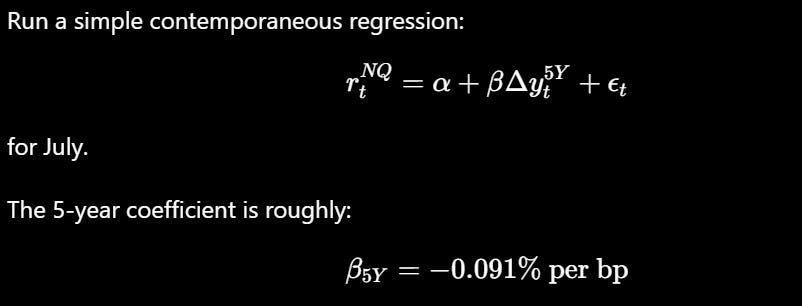
HAC p-value:≈0.058
Borderline by conventional frequentist standards.
Using a weak zero-centred Bayesian prior gives a posterior mean of approximately:
−0.074% per bp
with: P(β5Y<0)≈95.6%
That is enough for me to say something economically sensible:
During July, NQ was probably negatively sensitive to movements in the Treasury belly.
For SMH the evidence was weaker: P(β5Y<0)≈82.1%
Then August arrived.
NQ: P(β5Y<0)≈66.3%
SMH: P(β5Y<0)≈44.7%
Gone.
The belly told exactly the same story the 30-year had already begun telling us.
Rates mattered during the setup.
Their contemporaneous explanatory power weakened dramatically by August.
That should have made me suspicious of any narrative that blamed the eventual equity break mechanically on another rise in yields.
What the broader intraday regression said
Rather than throw 2Y, 10Y and 30Y into a regression independently and let collinearity make a mess of the interpretation, I decomposed the rate structure into a common level move and a slope shock.
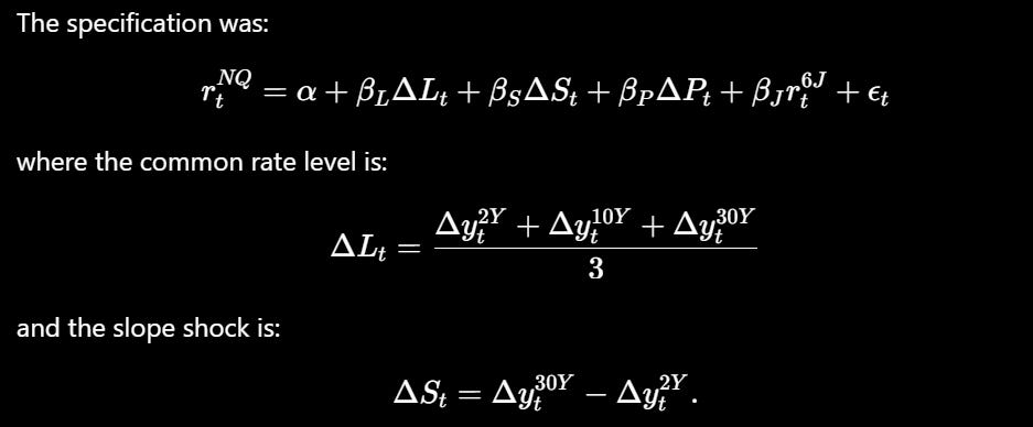
Policy repricing is represented by the change in the implied SOFR rate, and 6J gives us a directly traded yen measure.
July
For NQ:
β level = −0.0823% per bp, p≈0.073
β slope = −0.0780% per bp, p≈0.004
β policy = −0.0596% per bp, p≈0.011
R² ≈ 10.8%
The slope coefficient was the one I cared about.
A one-basis-point additional steepening of 30Y versus 2Y was associated with roughly:
7.8 bp of contemporaneous NQ downside
after controlling for the other factors in that specification.
The simpler 30-year regression was even more obvious.
July NQ: β30Y=−0.1196% per bp (p<0.0001.)
July SMH: β30Y=−0.1587% per bp (p≈0.008.)
Rates and technology really were travelling together.
I had a legitimate reason to worry.
August broke the model before it broke the market
Repeat the exact framework over Aug 1–18.
NQ:
β level = −0.0261%/bp, p≈0.49
β slope = −0.0317%/bp, p≈0.15
β policy = +0.0085%/bp, p≈0.84
R²:1.9%
The relationship largely evaporated.
Simple 30Y regression:
NQ:
−0.0350%/bp, p≈0.20
SMH:
−0.0568%/bp, p≈0.46.
That’s the part I think traders should pay attention to.
If the narrative were:
rising Treasury yields are increasingly strangling technology equities,
I would expect the rate/equity relationship to strengthen as the stress became more acute.
It didn’t.
It weakened.
The market was becoming fragile for reasons connected to rates.
But something else was starting to determine the marginal equity trade.
Those are not the same statement.
The Fed curve was surprisingly consistent with the original macro warning
This is one part of the original rates argument that held up exceptionally well.
On Aug 12, the front one-month SOFR future implied approximately:
3.6375%
The highest implied rate along the part of the SR3 strip we downloaded was around June 2027:
4.100%
Difference: 46.25 bp
The original discussion referenced roughly: 47 bp.
On Aug 17:
front:3.635%
peak:4.065%
Difference:43.0 bp.
The speaker’s number:
roughly 43 bp.
That wasn’t hand-waving.
The curve really did contain approximately that amount of tightening between the front and its mid-2027 peak.
And after that peak, very little easing was priced through the end of the strip we possess.
But there was a more interesting signal hidden underneath.
The long end was separating from the policy path
Between Aug 10 and Aug 17:
Peak expected SOFR:−8 bp
2-year Treasury:−6.1 bp
30-year Treasury:+6.1 bp
Think about that configuration for a moment.
Expected policy became easier.
The front end rallied.
And the 30-year sold off.
One crude but useful diagnostic is:

It is not term premium.
I would never label it that way.
It simply asks how punitive the long end has become relative to the highest policy rate embedded in the forward strip.
Approximately:
July 28: 91 bp
July 29: 106 bp
Aug 10: 111 bp
Aug 17: 125 bp
That is the signal I would have wanted on my desk.
Not because I know exactly why it is widening.
Because it tells me what I already suspected:
The expected Fed path had stopped being enough to explain the bond market.
Then the options market became almost absurdly relaxed
By Aug 14:
VIX1D: 9.18
VIX9D: 10.61
VIX: 14.26
VIX3M: 18.46
VVIX: 87.48
VIX9D/VIX:
roughly the 1.5th percentile of our 2025–2026 sample.
VIX/VIX3M:
around the 0.7th percentile.
Protection in the front of the curve was cheap.
Really cheap.
Between Aug 14 and Aug 17 something subtle changed:
VIX1D −9.4%
but:
VIX9D +16.8%
VIX +6.5%
VIX3M +3.1%
VVIX +7.4%
The market was still remarkably relaxed about the immediate session, but it had started paying for risk just beyond it.
I initially thought this might be a terrific crash signal.
Then I tested it.
It isn’t.
Historically in our sample, extreme front-end volatility compression generally forecast continued quiet more often than it forecast an explosion.
So I had to throw away another attractive story:
Extreme VIX contango does not mean “crash tomorrow.”
What it can mean is:
If the system is already fragile, protection is unusually inexpensive.
That is a positioning fact.
Not a standalone directional signal.
Aug 18: this is where the original causal story failed
Most of the semiconductor damage had occurred before the U.S. cash market even had a chance to trade.
From the Aug 17 U.S. close to Aug 18 09:30 ET:
NQ −1.44%
ES −0.53%
Nikkei futures −2.98%
Meanwhile:
2Y −0.5 bp
10Y −0.6 bp
30Y −0.6 bp
SOFR futures:
essentially unchanged.
Fed Funds futures:
essentially unchanged.
The technology complex was getting hit while Treasuries were rallying.
SMH’s eventual Aug 18 decline was approximately: −4.1%.
Most of it arrived through the opening gap.
During the U.S. session, 30-year yields fell further.
I can still say rates helped make the market fragile.
I cannot honestly say rising rates mechanically caused most of that selloff.
The clock is pointing the wrong way.
The yen didn’t rescue the carry-trade story either
I expected this test might salvage part of the original narrative.
It didn’t.
During the crucial overnight window:
6J −0.07%
A stronger 6J means a stronger yen.
So the yen actually weakened slightly while Nikkei futures fell nearly 3%.
AUDJPY:
+0.21%
MXNJPY:
+0.05%
USDJPY:
slightly higher.
If the initial liquidation were driven by a classic yen-funded carry unwind, I would want to see something like:
yen strengthens → carry crosses collapse → leveraged risk comes off.
Instead:
risk came off.
The funding-currency confirmation didn’t.
The yen may still have been a latent vulnerability.
It wasn’t the proximate Aug 18 trigger.
Credit blinked. Crypto barely noticed.
HY OAS moved:
2.70% → 2.75%
Five basis points.
IG:
0.81% → 0.82%
One basis point.
Not nothing.
Not a funding seizure either.
And while:
SMH fell ~4.09%
Nikkei ~4.05%
NQ ~1.69%
ES ~0.70%
Bitcoin was approximately:+0.31%
Ethereum:+0.25%
That was useful because crypto served as a kind of negative control.
If the world were undergoing a violent generalized dollar-liquidity deleveraging, I wanted to see more things breaking.
They weren’t.
The violence was concentrated.
Growth.
Semiconductors.
Japanese technology/high beta.
Not everything with a price.
So what actually happened?
The most parsimonious sequence I can construct from the data is this:
First: real yields rose sharply through July.
That increased the discount-rate pressure on expensive duration assets.
Second: around July 27–29, the shape of the rates move changed.
The 5-year stopped accelerating.
The 10-year and 30-year didn’t.
The curve began pivoting outward.
Third: the expected Fed path ceased explaining the long end particularly well.
The 30Y-versus-peak-policy residual kept widening.
Fourth: by mid-August, near-term equity protection was extraordinarily cheap and positioning still looked relaxed.
Then:
something hit the crowded growth/AI complex.
Once that happened, the actual equity liquidation no longer needed Treasury yields to rise contemporaneously.
By Aug 18, Treasuries were rallying into the equity weakness.
The setup was macro.
The trigger and propagation looked increasingly like positioning.
Bayesian scorecard: what I believed before and what survived the data
Problem with eye-tricking chart movement, convenient narratives, lazy commentary ? adopt hypothesis test framework to filter the narratives. below table shows what survive the testing , and what are rejected.
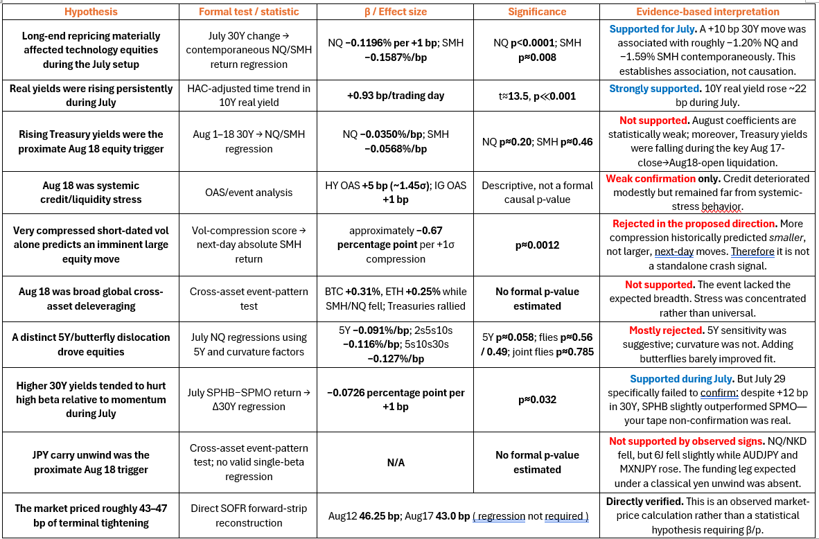
The lesson wasn’t “sell equities when the curve steepens”
If that’s the conclusion, we’ve wasted the exercise.
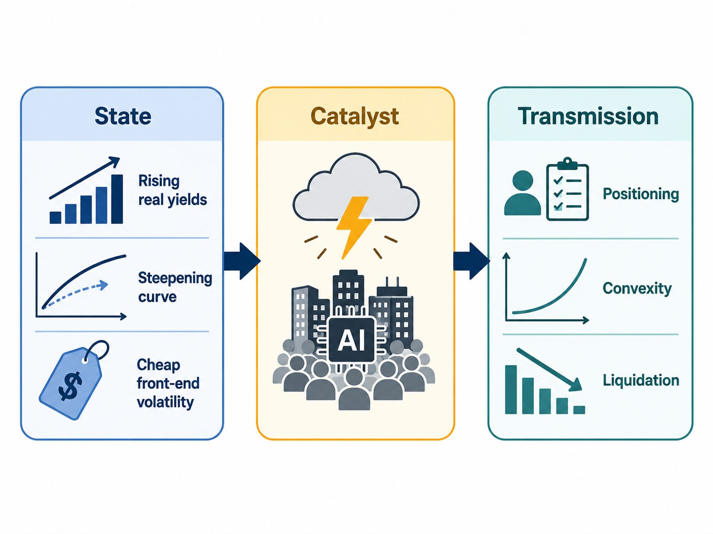
The more useful lesson is that markets have states, catalysts and transmission mechanisms, and those three things don’t have to be identical.
Real rates can create the vulnerable state.
A long-end repricing can make that state worse.
Cheap volatility can encourage positioning that increases convexity when something finally moves.
Then the actual catalyst can arrive somewhere else entirely.
And once it does, the transmission mechanism itself can change.
That is exactly what the July–August data appears to show.
During July, rates explained a meaningful part of technology’s intraday behaviour.
By August, that explanatory relationship had deteriorated.
And when the real equity break finally arrived, rates rallied.
That is why I keep coming back to one line:
The curve was the setup. It wasn’t the trigger.
If I had been watching only price direction, I might have missed that.
If I had been watching only the 30-year, I would have missed the 5-year telling me when the character of the repricing changed.
If I had been watching the butterflies because they looked sophisticated, I might have invented explanatory power they didn’t have.
And if I had refused to abandon the original “rates caused it” thesis after Aug 18, I would have been fitting the tape to my story rather than the other way around.
For a trader, that last mistake is usually the expensive one.
Disclaimer : The information presented here are for research and education purpose only, and does not constitute investment advice, trading recommendation, author shall not liable for any action taken by any individual/company with regards to the information presented here or any part of the website - https://marketcycleedge.substack.com/
The views expressed on this website represent the current, good faith views of the authors at the time of publication. Please be aware that these views are subject to change at any time and without notice of any kind. Marketcycleedge.substack.com and its author assumes no duty and does not undertake to update these views or any forward-looking statements, which are subject to numerous assumptions, risks, and uncertainties, which change over time. All material presented herein is believed to be reliable, but we cannot attest to its accuracy. The information contained herein (including historical prices or values) has been obtained from sources that marketcycleedge.substack.com and its author considers to be reliable; however, marketcycleedge.substack.com and its author makes no representation as to, or accepts any responsibility or liability for, the accuracy or completeness of the information contained herein, or any decision or action taken by you or any third party in reliance upon the data. All traders and investors are urged to check with Financial advisors before making any trading /investment decision.